Neon Museum
The Neon Museum Las Vegas is a non-profit organization, founded in 1996, dedicated to collecting, preserving, studying and exhibiting iconic Las Vegas signs for educational, historic, arts and cultural enrichment. The purpose of this rebrand is to create an immediately recognizable brand identity that embodies the fun and historic nature of the ephemera displayed. This refreshed system is graphic, bold, and modern, yet invokes a sense of nostalgia by utilizing iconic imagery and symbols inspired by the signs themselves. This creates a carefully-considered and memorable system, which can be used across various platforms and expanded upon as the museum expands.
DELIVERABLES
Brand Strategy
Style Guidelines
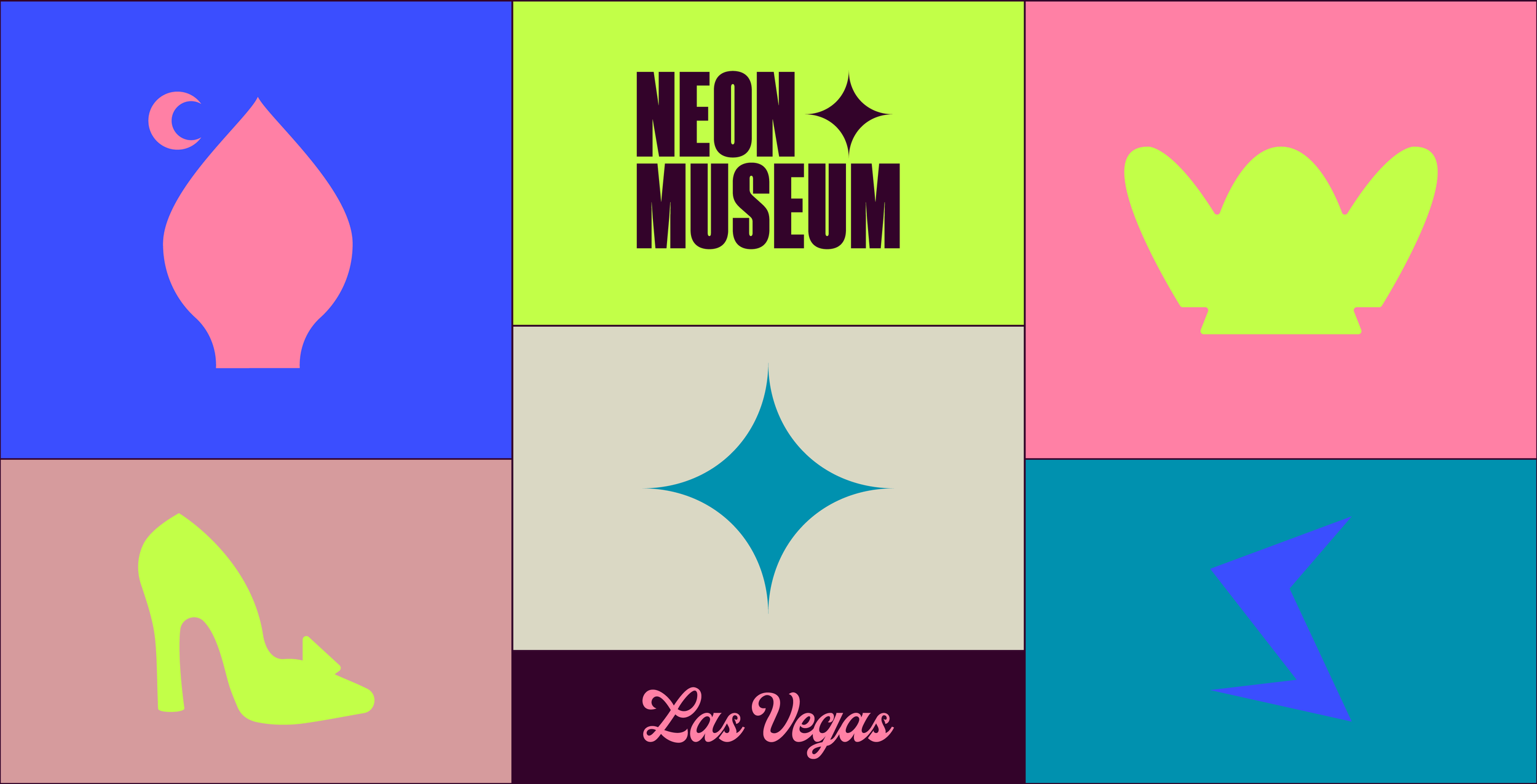
The primary logo is formed from a bold condensed sans serif typeface. The use of uppercase highlights the bold and sturdy nature of the brand. The star icon was inspired by the dazzling stars surrounding the iconic Moulin Rouge sign. Paired with this is a script writing out ‘Las Vegas’, evoking the timelessness of the brand, as well as the city itself.
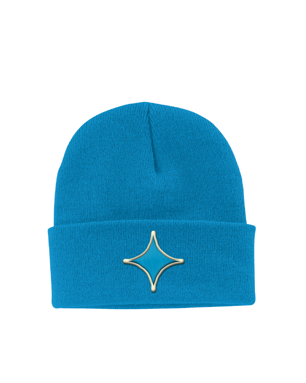
The star icon can be pulled out and used as a brand element.
The primary logo will likely be the version that is most recognized, however there are several alternative variations.
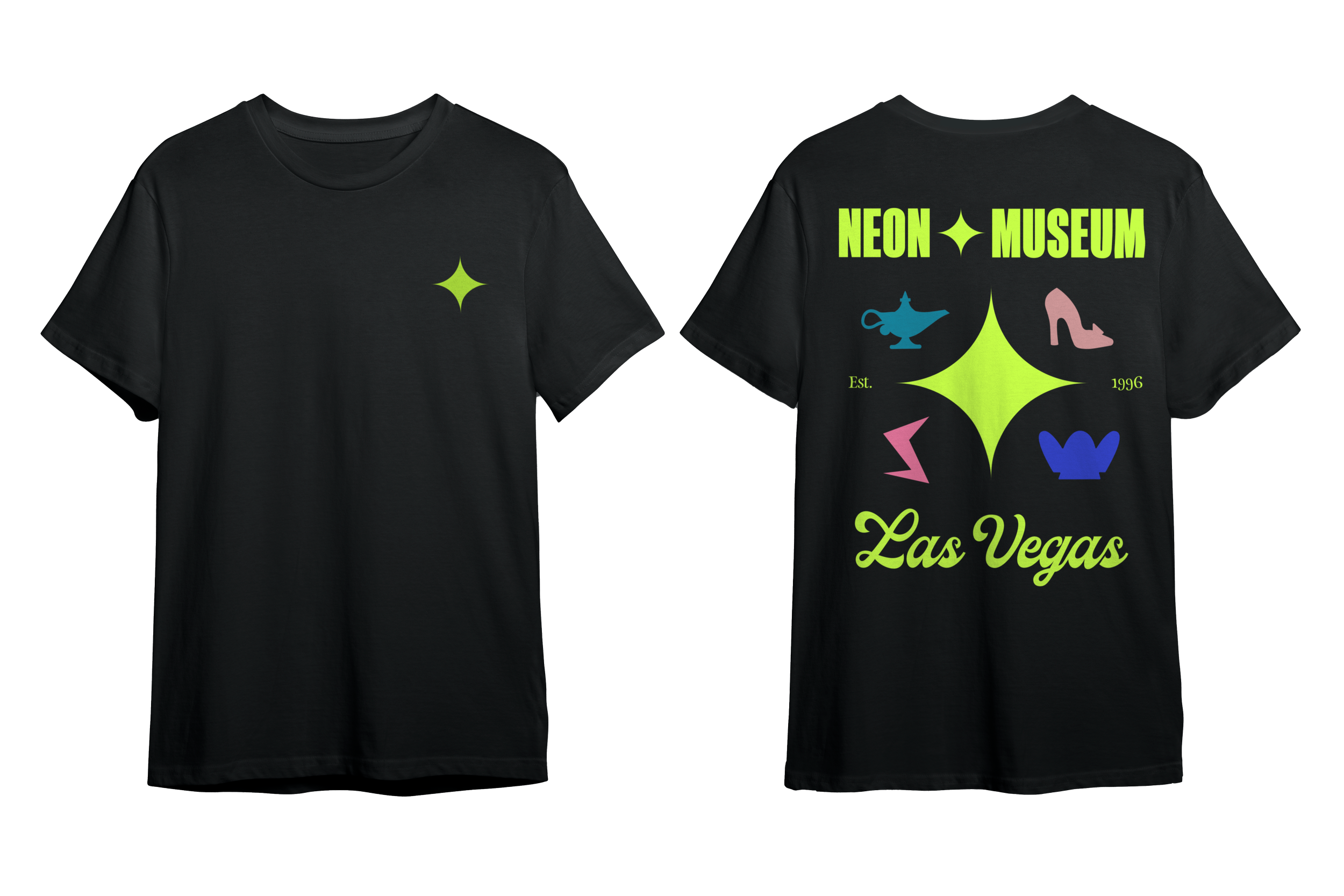
Primary LogosThe alternate logos borrow elements from iconic signage from the museum: the Hard Rock Cafe guitar, the Stardust ‘S’, Tim Burton’s Lost Vegas installation, the La Concha shell, the Silver Slipper heel, and Aladdin’s Lamp.
Each of these icons can be pulled out from the logo mark and used as brand elements.
This system can continue to adapt as new signs are rescued and brought into the museum.
Alternate Logos
The Neon Museum Las Vegas celebrates neon, of course, and this color palette represents fluorescent signage without feeling too predictable or gaudy.
Colors with high brilliance are contrasted with less saturated ones, and grounded with neutrals to give ‘vintage meets modern’.
Colors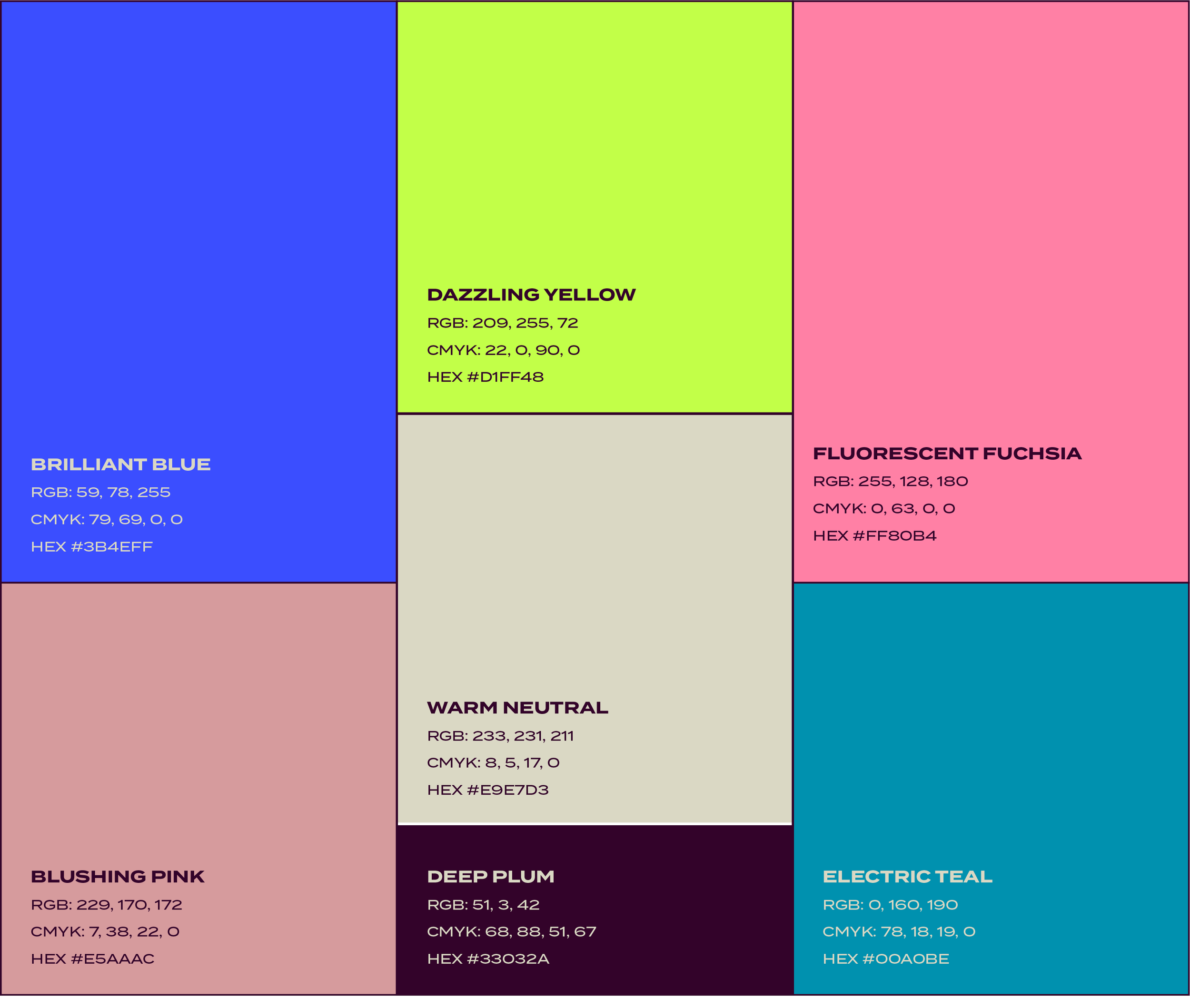

Typography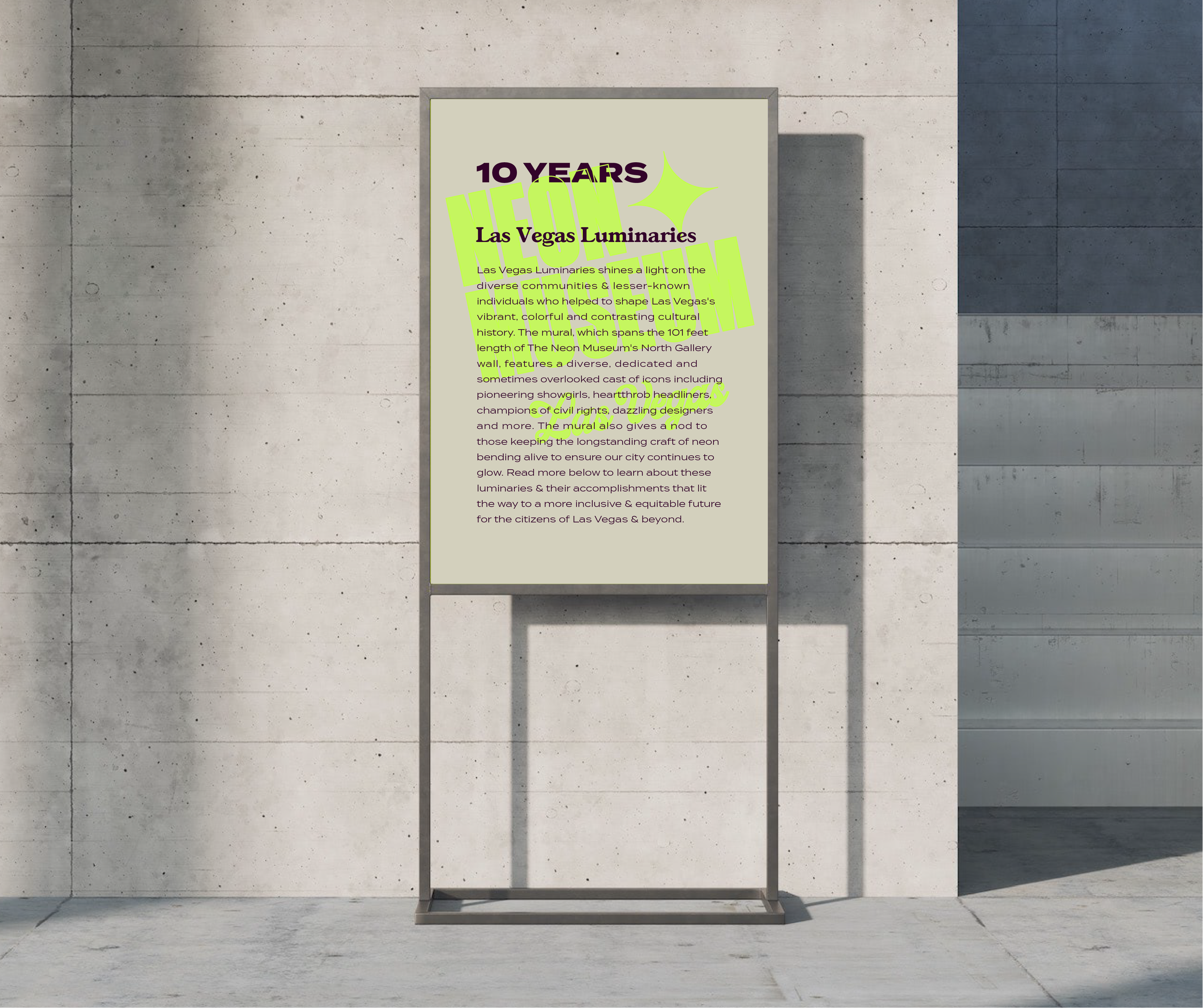
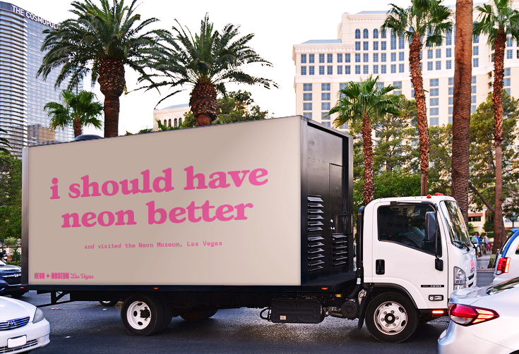
Ads make use of bold typography, punny copywriting, macro shots of ephemera, and neon overprint to capture the museum’s vibe, generate interest, and draw attraction.
advertisement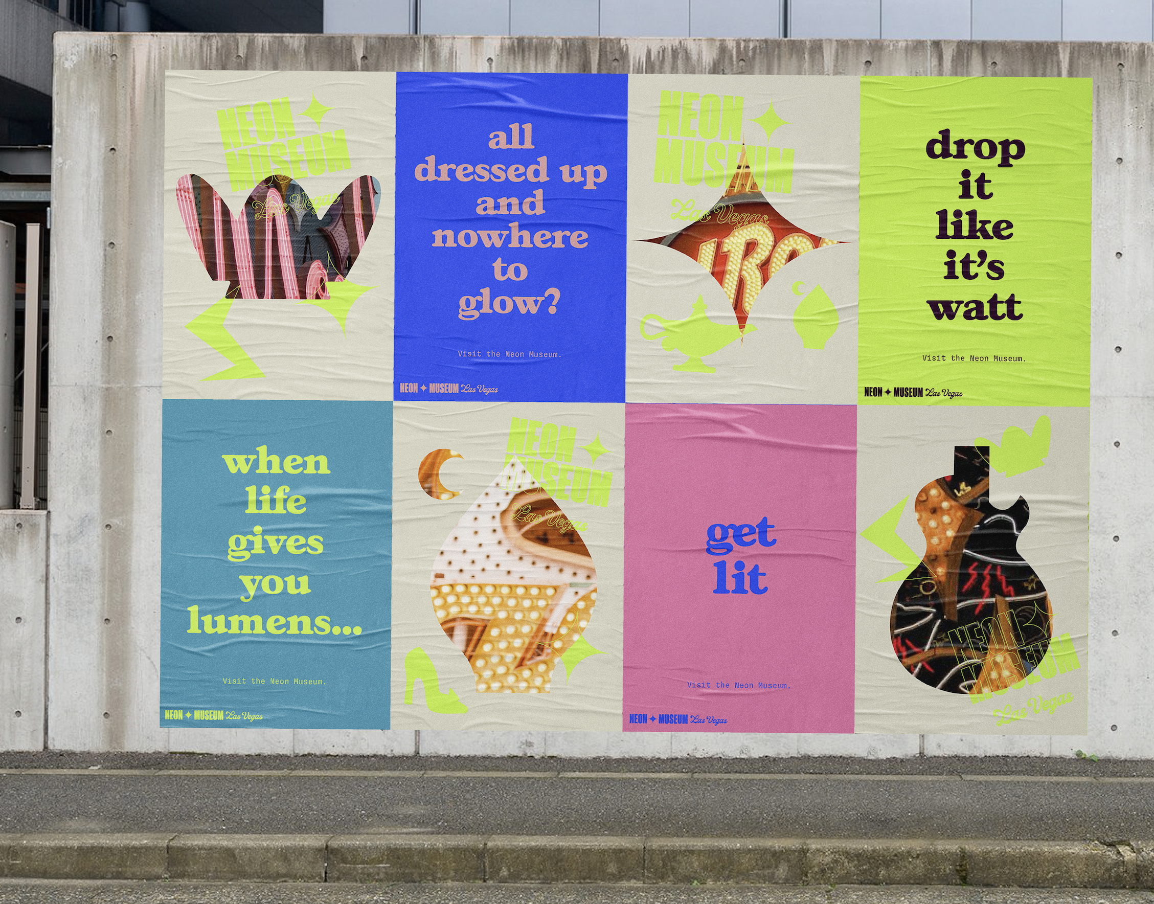
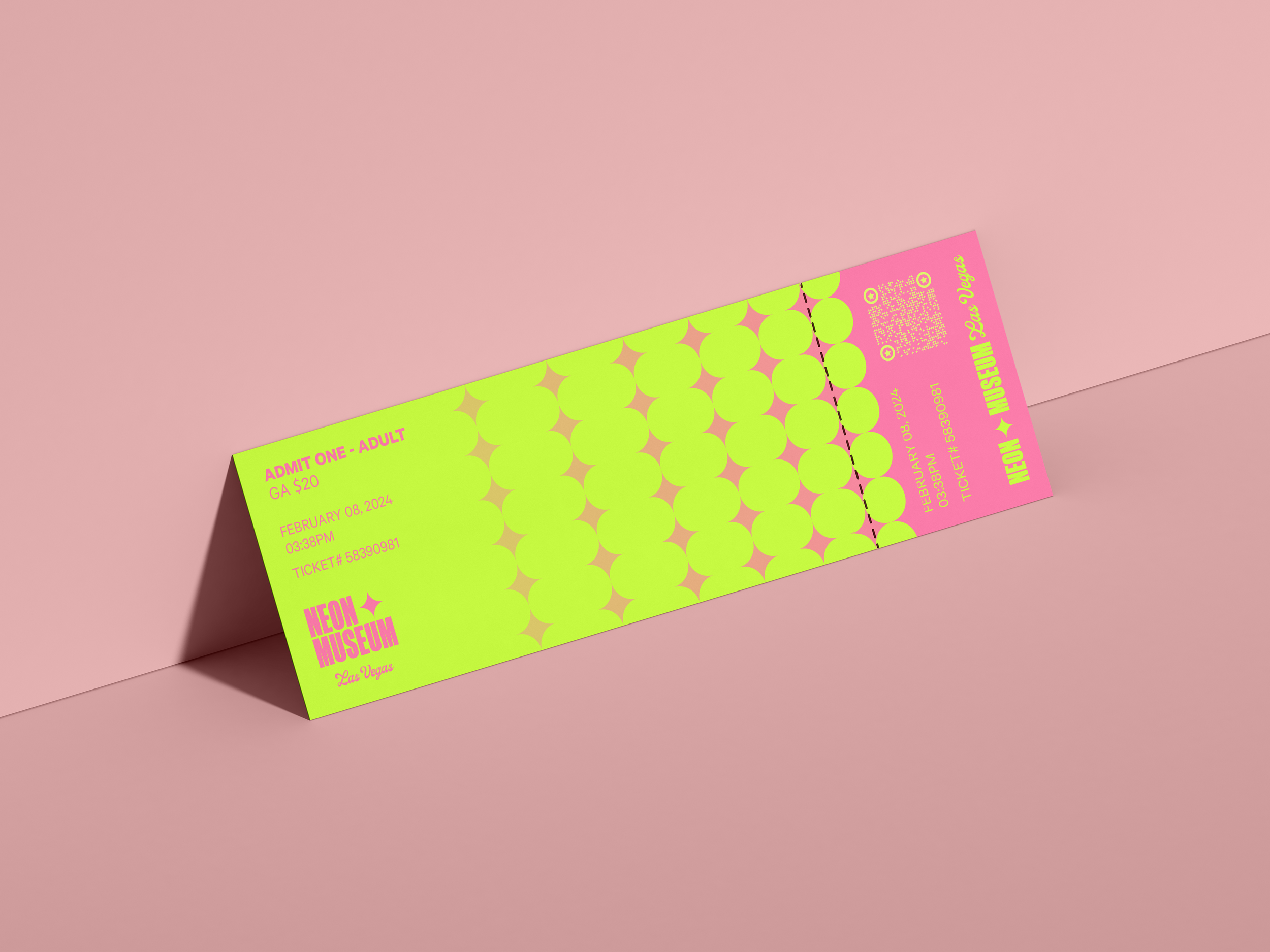
Tickets vary in color depending on the type, but all utilize the star as a brand pattern.
print collateral

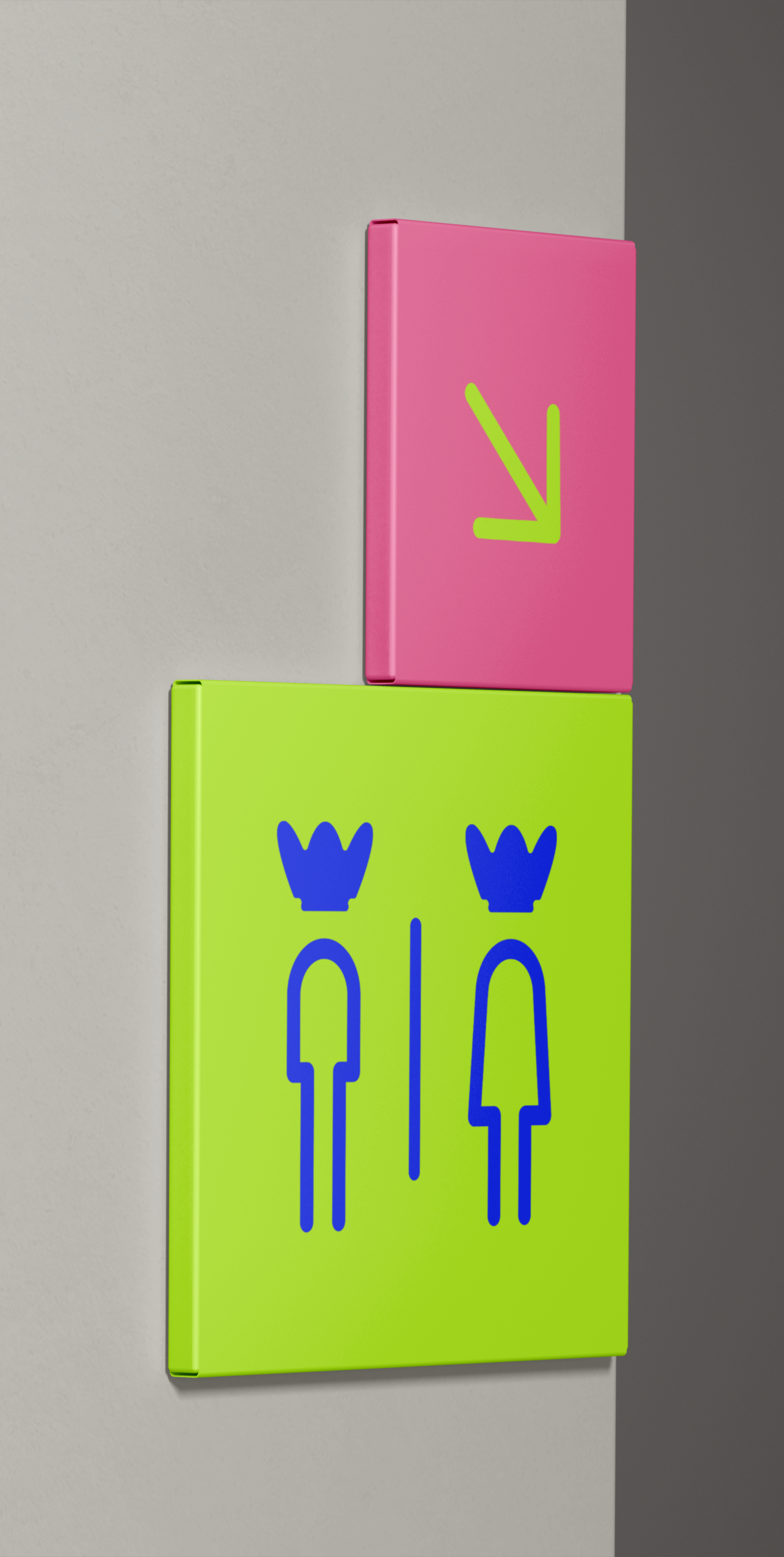
Environmental designs and wayfinding are geometric and graphic, much like the brand. They are used sparingly as to not take away from the historic architecture and ephemera.
environmental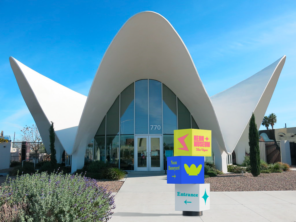


merchandise

Social media, particularly Instagram, is an important aspect of the marketing strategy and a strong method of promotion, so maintaining a consistent look for the feed is key.
Posts and stories should all feel as though they stylistically belong together, and should always include imagery, brand icons, and/or brand colors (or purposeful variations of them).
SOCIAL
